New healthtech product launch
Dring content design and strategy of new product launch and strategized A/B test variations for home, product and other key landing pages, resulting in 6% order conversion, +14% in traffic and 45%+ improvement in A/B test results.
OVERVIEW
Role
Senior UX Writer & Content Strategist, Growth & Product Marketing
I collaborated with designers, PM, devs, health experts and legal in an agile environment on microcopy and product positioning to optimize copy variations for A/B testing and new product launches.
Goal
Launch new products, improve brand visibility and drive traffic to the site, and increase conversion and reduce churn
Impact
Exceeded conversion goal with 6% and smashed 45%+ A/B test result goal
Exceeded visitor to order conversion goal with 6%
Wrote Black Friday sale copy:
+860 orders, +97% order conversion (best performing sale)Delivered +14.1% YoY increase in website traffic (SEO)
Resulted in 34.1% YoY increase in website conversions (SEO)
Smashed 45%+ A/B test result goal with an 87% increase
PROBLEM
Increase visitor to order conversion and empower users to overcome the stigma and confusion around buying over-the-counter hearing aids.
Users want to overcome barriers, hear better
Stigma around hearing loss/hearing aids
Hearing loss impacts family, work
Withdrawn from everyday, social events
Too many DTC/OTC choices
Outdated view of tech/too expensive
PROCESS
Focusing on principles
Findable
• Deliver copy to fulfill user goals of helping them find the right product and business goals of improving brand visibility and driving traffic to the site
Clear
• Reduce confusion around medical terminology and technological jargon
Human
• Strike the proper balance of empathetic and benefit-driven for UX microcopy, product marketing pages and SEO articles

How I worked
Collaborators
• Product marketing
• Senior product designer
• Design director
• CEO
• Marketing/brand
• Sales/customer experience
• SEO agency
• Audiology experts
• Legal
Work I did
• Wrote clear UX copy and A/B test messaging strategies
• Drove content strategy of new product launch
• Defined pillar content structure based on on-page SEO / AEO goals
• Evaluated product positioning to craft content
• Improved accessibility using Gemini AI and WCAG guidelines
• Presented “AI Moment” to company and prompting tips
• Uncovered company-wide inefficiencies/pain points and highlighted cross-functional opportunities
• Created acronym dictionary to further increase clarity and efficiency for cross functional teamwork
Skills/software used
• Figma / FigJam
• Google Suite
• HTML
• Payload content management system
• Competitive analysis
• SEO keyword research
• Terminology workshop

1 Empathize
Users have both emotional and practical goals when looking for their next hearing aid.
2 Strategy


Considering user and business goals
I wanted to ensure we communicate that we provide value to the user while balancing business and customer goals to deliver results.
3 Research

User test revealed lack of social proof, too much content on mobile
Wrote A/B copy for content test and suggested test plan questions:
Insights:
• Participants expected to see social proof (Trustpilot) that was missing
• ~50% of participants thought that there was too much content on mobile
• Users were confused whether debt relief was a loan
• Messaging for custom offers and payment plans resonated with prospects
Testing different content structures, messaging
• Worked with our UX researcher to test copy that had different information architecture, value props, CTAs, tones, and more
• Suggested questions for the test plan so insights helped refine the structure and copy

Validating brand voice and tone
• UX research validated the voice and tone of the test copy. The encouraging tone was important to motivate users to explore their options, the straightforward tone is important to educate prospects effectively about financial products that could seem complex

Finding what value props were most important to users
• Test results showed the top value props that were later used to help determine the order of the value prop section in the design

Incorporating the insights and refining copy
• Later incorporated test results into the final copy including top value props and their order, and a FAQ on customized plans

4 Iterate
Refining content to reduce copy and focusing on the most important value props
Content design:
• Went forward with concept A information architecture, the winning concept where prospects will see the product information first before using a tool to find the best solution for them
• Added FAQ on how to customize payment plans based on user interest
UX microcopy:
• Reduced copy in headings and descriptions
• Wrote clear and actionable headings
• Emphasized custom plans value prop (No. 2 most appealing from UX research) through CTA button copy like “Customize your plan”
Deciding on the winning concept
• Went with concept A information architecture (IA) based on research findings
Refining the content based on the research
• Iterated on copy including order of value props, added CTA button copy like "Customize your plan" to highlight No. 2 most appealing value prop (Customized payment plans)
• Went through multiple stakeholder rounds of feedback, including with the Co-CEO and brand VPs, director, and managers.


5 Handoff

Compliance review & dev handoff
• Facing challenges of whether debt relief is a debt consolidation product or not, I initially prepared prototypes where
1. debt relief was in the same product section as loan products 2. debt relief was separate
• Legal & compliance decided debt relief was debt consolidation so I used the prototype where there was only one product section
• Used compliance doc as a source of truth for final copy for dev handoff
Handing off the final version
• Created a compliance document for compliance review to note the before and after copy changes
• Compliance docs are often used as the source of truth for final copy for our development team

Launching the live version
• Here’s the live version on the site: https://www.achieve.com/debt-consolidation
OUTCOME
Before

Old product page - product-focused
❌ Relays the product features, not the user benefits
❌ Complex jargon like “proprietary speech-clarity technology”
❌ Long descriptions add to cognitive load
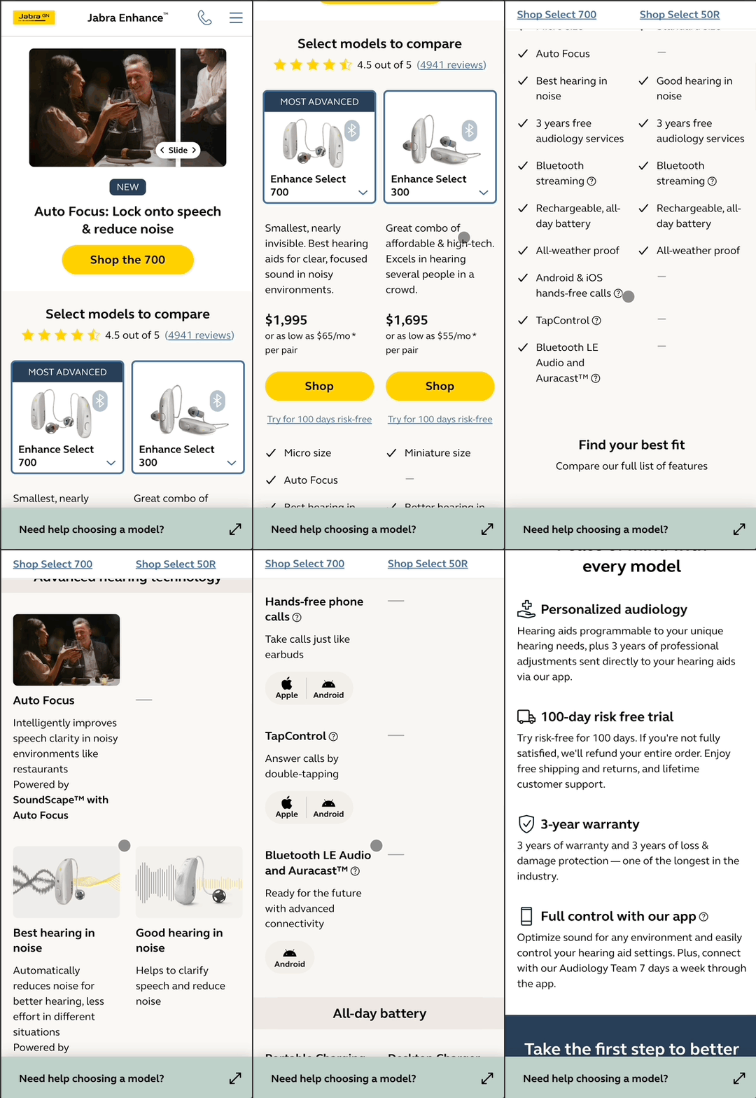
After

New product launch - user-focused
✅ Gets to user benefit faster
✅ Less jargon. More tangible, feels real
✅ About what users want to do
✅ Exceeded visitor to order conversion goal with 6%
✅ Wrote Black Friday sale copy:
+860 orders, +97% order conversion (best performing sale)
✅ Delivered +14.1% YoY increase in website traffic (SEO)
✅ Resulted in 34.1% YoY increase in website conversions (SEO)
✅ Smashed 45%+ A/B test result goal with an 87% increase