FREEDOM DEBT RELIEF TERMS
Simplifying the Terms page from hard-to read legal jargon to plain language—dropping it 6 grade reading levels so the average person can understand it.

OVERVIEW
Role
Staff UX Writer
In this content-first approach (vs design first), I worked with legal & compliance, life cycle marketing, and design so users clearly understand the risks and benefits of the program.
Goal
Redesign and rewrite the Terms page so it’s easier to read with more user-friendly language and page structure.
Impact
61% pull through rate
up 2% vs control
Lowered 6 reading levels
vs. 13 grade level at the start
PROBLEM
How might we simplify the Terms language so more people understand it and are less likely to drop out?
• One of the top reasons for customer termination is being unaware of or misunderstanding the debt relief program
• The end-to-end research found many consumers were unlikely to read the Terms content because of its complexity, both in languge and length
• The Terms page was Grade 13 reading level while the average reading level is grade 7-8th in the U.S.
“I wouldn’t read it in the real scenario. No, wouldn’t read it.”
– Participant in the end-to-end enrollment flow study
Improving confidence to take the next step
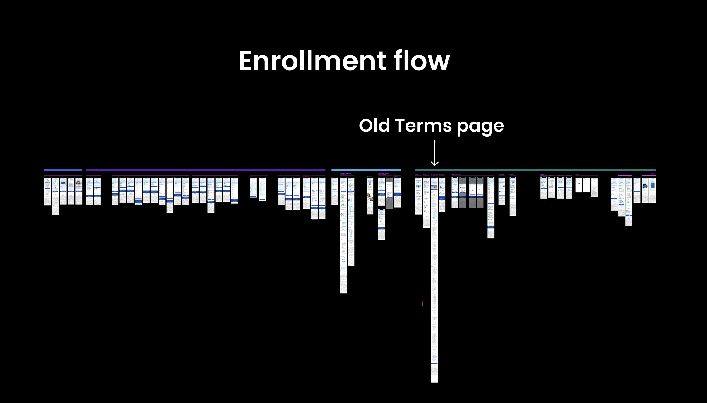
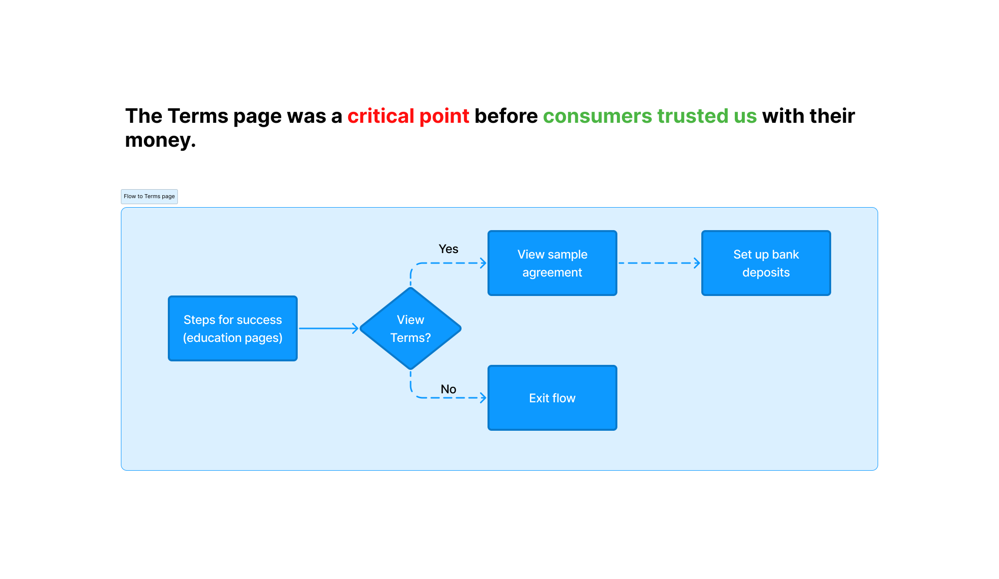
• The Terms page was critical because users saw it before entering their bank information so trust and understanding were big factors to moving forward.
• Users who are not confident about what they’re signing up for may be less likely to take the next step of signing up for automatic deposits of their money.
PROCESS
Focusing on principles
Findable
• Structure the content so users can more easily scan and find crucial information
Clear
• Ensure content is between 6-8th grade reading level and written in plain language to prevent misunderstanding
Human
• Speak to consumers in a friendlier voice and tone to build relationships, not just in legal language to fulfill a transaction

How I worked
Collaborators
• UX designer
• Product manager
• Life cycle marketing writer
• Director of life cycle marketing
• VP of brand
• CEO of Freedom Debt Relief
• Legal & compliance officers
Work I did
• Performed competitive analysis of information architecture in Miro for 8 other companies
• Structured the information of the page for a content-first design
• Wrote simplified content to reduce jargon and lower the reading level
• Led feedback sessions with brand, life cycle marketing, and legal & compliance to refine content
Skills/software used
• Figma
• Miro
• Divvy (legal & compliance tickets)
1 Discover

Solving user pain points
User pain points
• Misunderstanding how the program works is a top reason why customers terminate from the program
• Many users are unable to read and understand the entire Terms because of the length of the page and jargon
User profile
Stability Seekers - neutral to negative cash flow, lower financial competence
Anxious Anticipators - neutral to negative cash flow, higher financial competence
2 Strategy
Improving information architecture & speed of scanning
• The information architecture and structure of the content was crucial to the speed and ability at which users understood the Terms content
• I had to ensure users were able to find and scan the most important information, especially in this long-form content
Voice and tone:
• Straightforward
• Knowledgeable
• Caring
• Optimistic
3 Research

Answering the most common user questions quickly
I pulled from end-to-end research insights about what information was important to users so I could make that information more obvious on the Terms page:
Common questions asked
• How does debt relief work?
• How will this program affect my credit score?
• What is the program guarantee?
I also did competitive analysis of other Terms pages to determine the best information architecture of the updated page.
Simplifying complex language to improve trust and confidence
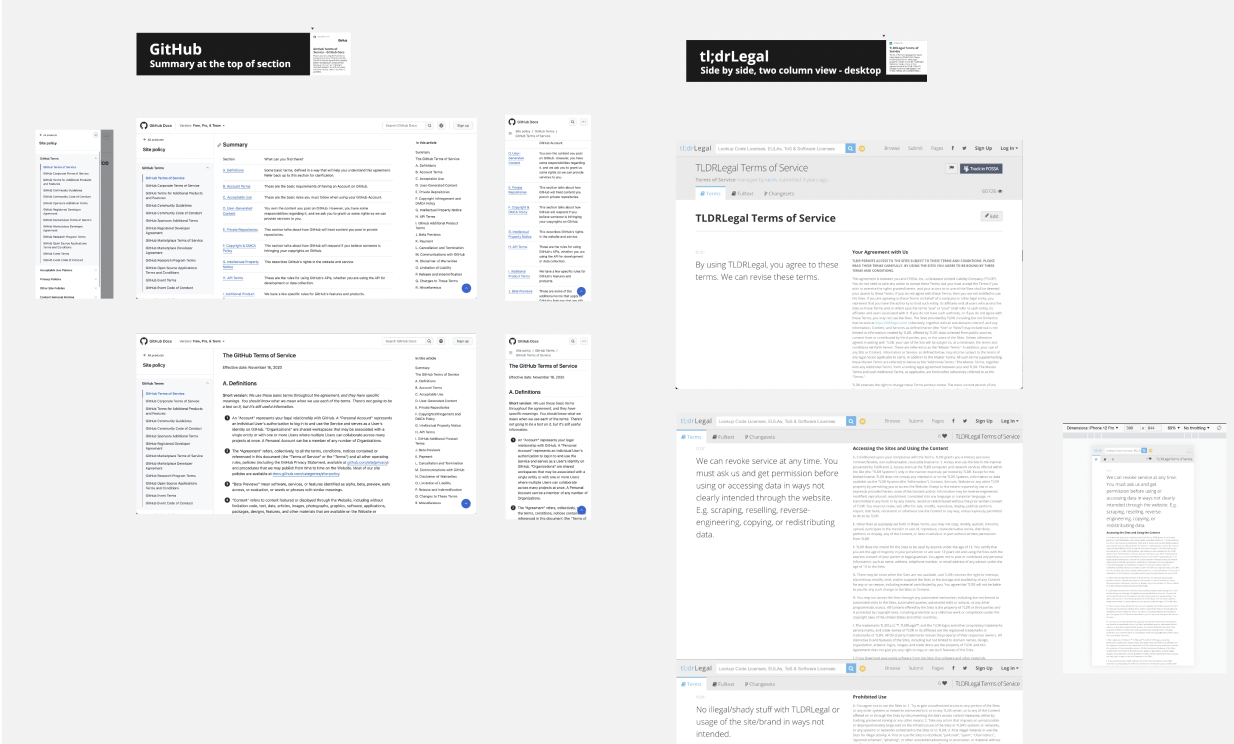
• Put together a Miro board of different terms pages from 8 companies like Pinterest, GitHub, and Airbnb to determine different ways to structure and clarify information on Terms pages
• Decided on information architecture similar to GitHub and Pinterest because they had summary boxes to distill the most important information up front

4 Iterate

Designing content first and iterating on the structure
Content design
• I wrote several variations of what the content structure could look and sound like to help determine the best one with legal & compliance and other stakeholders.
UX microcopy
• Wrote content summary, headings, and paragraphs for the entire Terms page
• Emphasized value props and highlighted information users found important (credit impact, how it works)
Experimenting with writing the Terms page in different approaches
• Created a Miro board to compare the original Terms language, what was legally required, and more user-friendly language. The original language was much longer so I reworked the content to be more concise
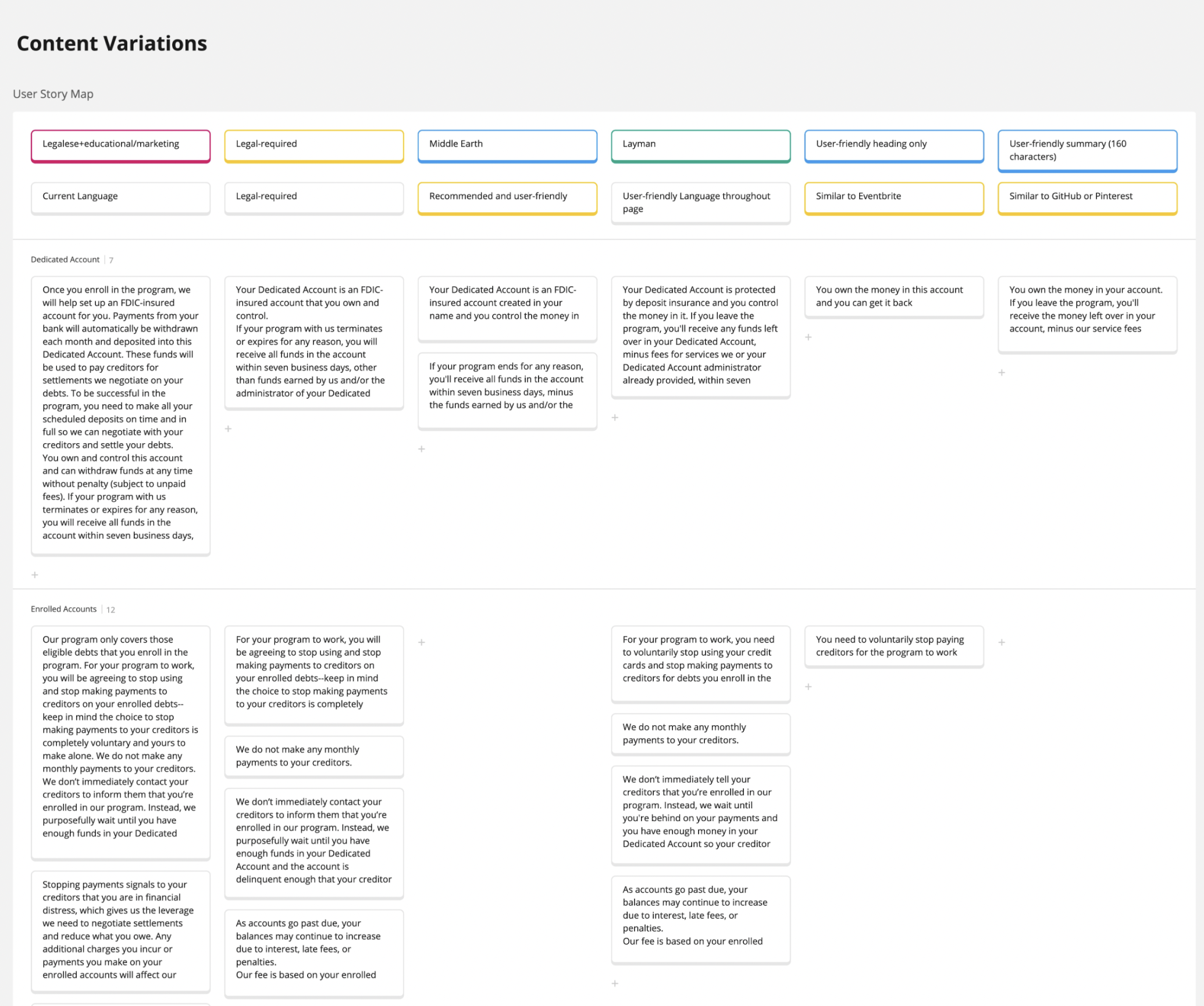
• I led sessions with legal and compliance to refine the information architecture and combine sections with similar topics from 12 sections to 6

• Lowered the reading grade level for each main section so it’s easier to understand, especially considering accessibility guidelines and users who speak English as a second language
• In this section, I dropped the reading level from grade 13 to grade 7 — the average American reading level
• Since it was a content first approach, I handed the information architecture and content off to our designer for design exploration
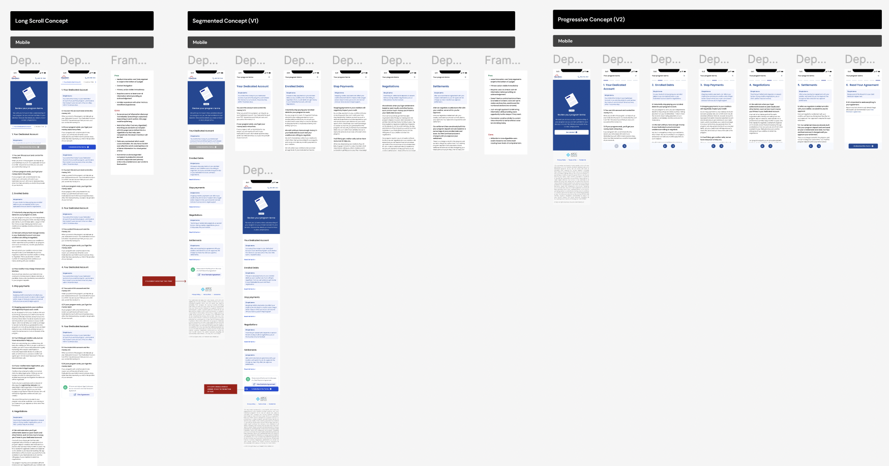
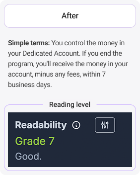
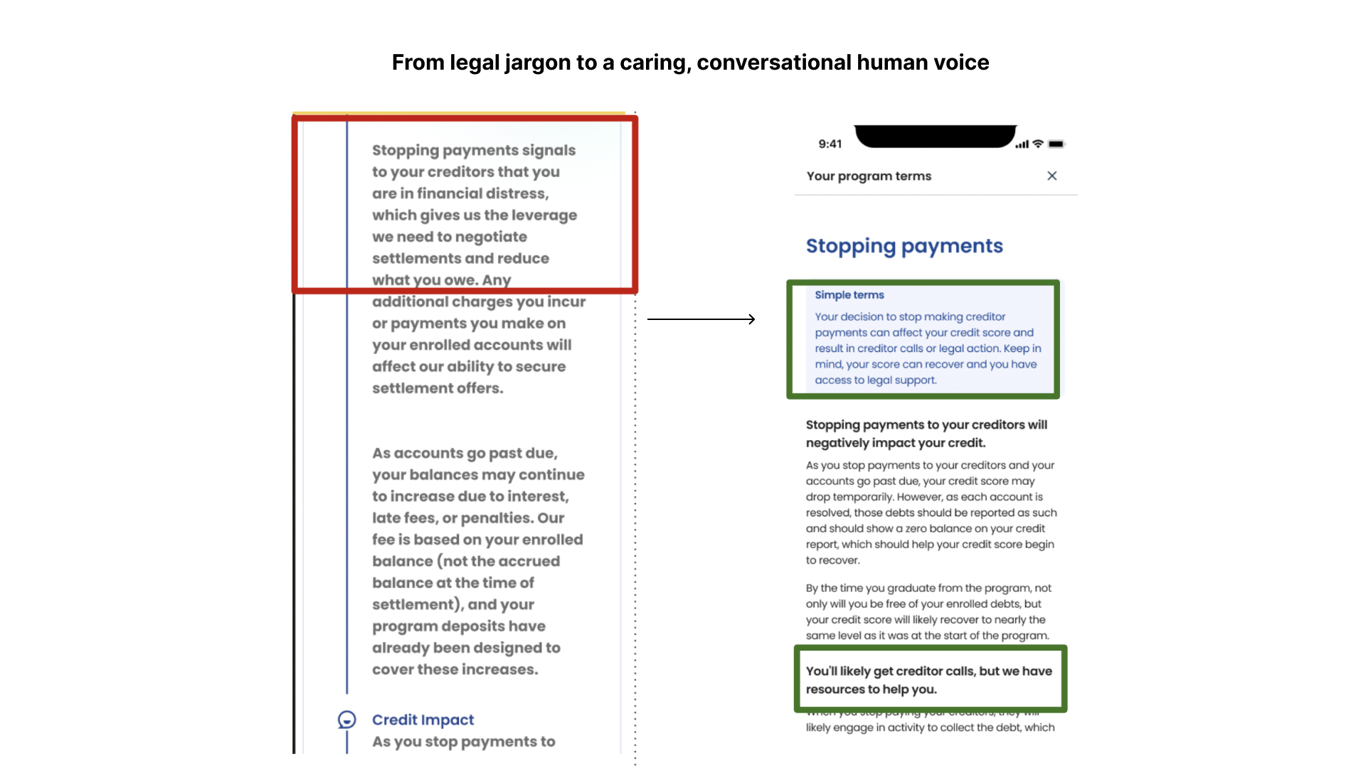
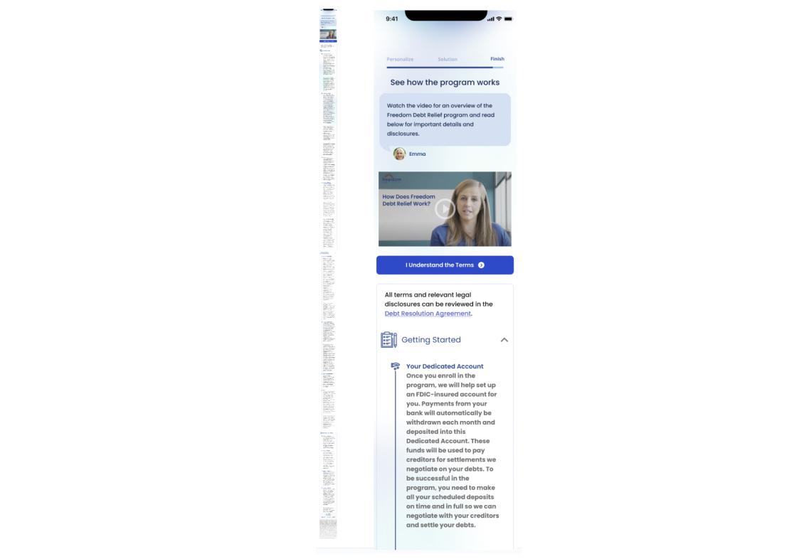
• “Simple terms” summaries give brief overviews of entire sections. Users have a choice to read more at their speed
• Copy is scannable with “Simple terms” summary box & headings as visual anchor points to follow natural “F” pattern of how people normally read
• Simplified explanation of subject with heading summaries
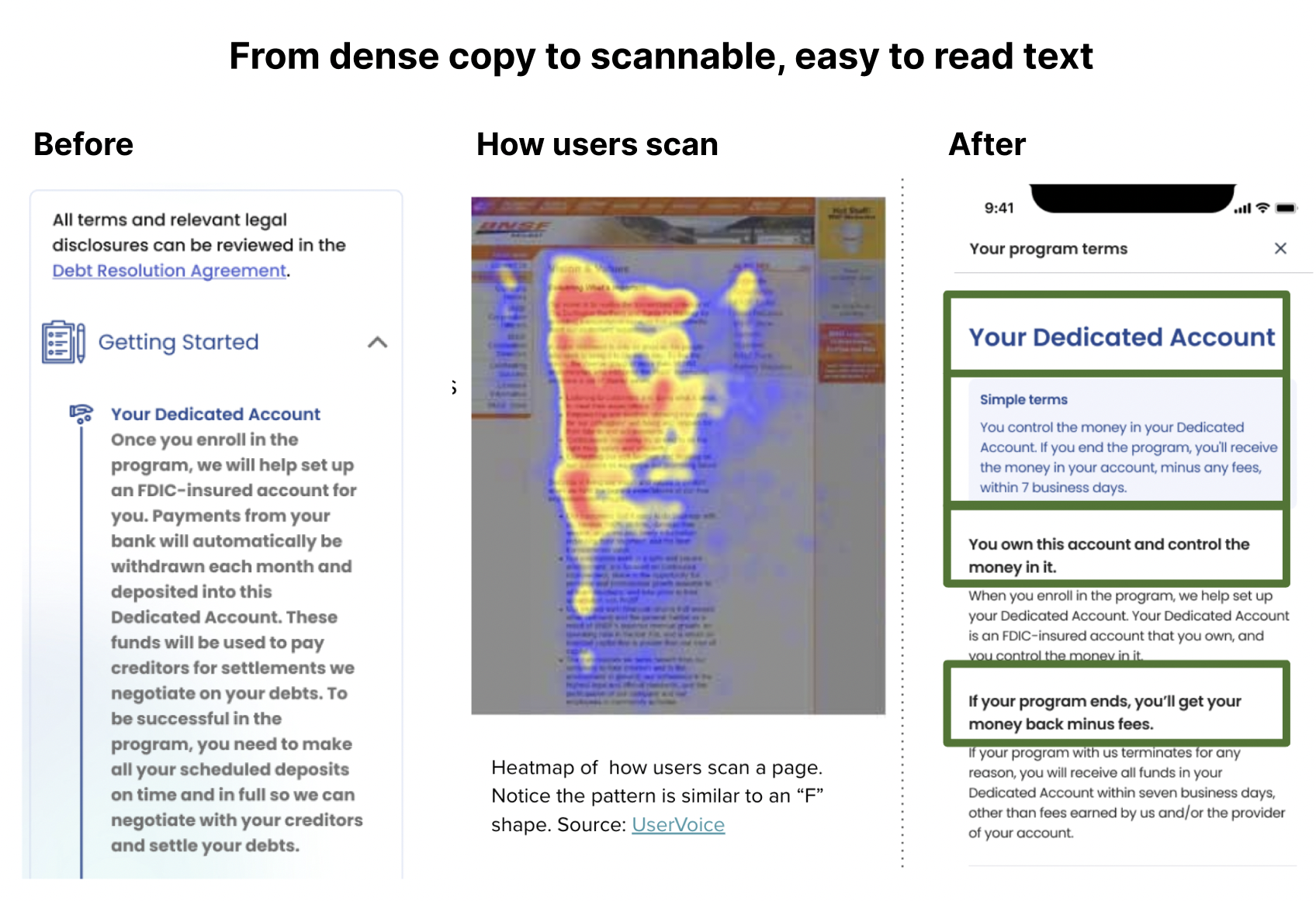
• Anticipated user questions and concerns around the legal and credit consequences
•Addressed top concerns immediately in the “Simple terms” where users are more likely to scan: summaries and headings
• Introduced brand voice and tone attributes into legal copy to humanize the Terms experience, including Straightforward through clear language and Caring through mentioning legal help and support
• Differentiated the brand as a consumer-centric brand through a user-friendly Terms page
5 Handoff
Finding the right words with legal & compliance
• Collaborated with legal & compliance in multiple feedback meetings and in a Google doc for compliance review.
• Went back and forth with legal & compliance to find the most straightforward yet compliant way of describing Terms
Handing off the final version
• Finalized the Terms page after stakeholder reviews and feedback from the VP of brand and CEO
OUTCOME
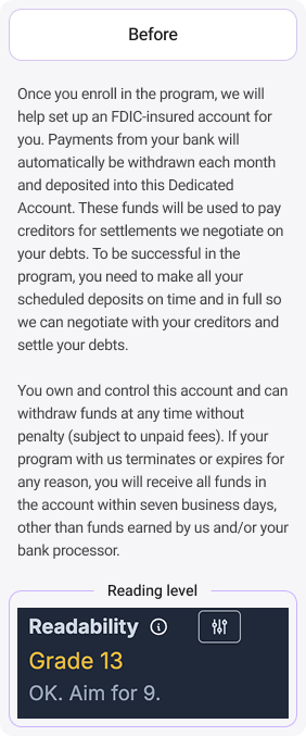
Before
Terms page - before
❌ Users found the Terms page daunting to read, according to past UX research
❌ The Terms page read like a long block of text that was hard to scan or parse through information
❌ Grade level 13
❌ Had 12 sections and 1,500+ words
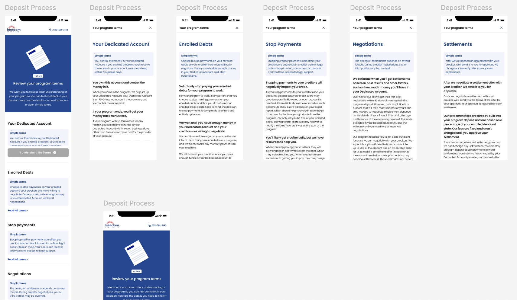
After
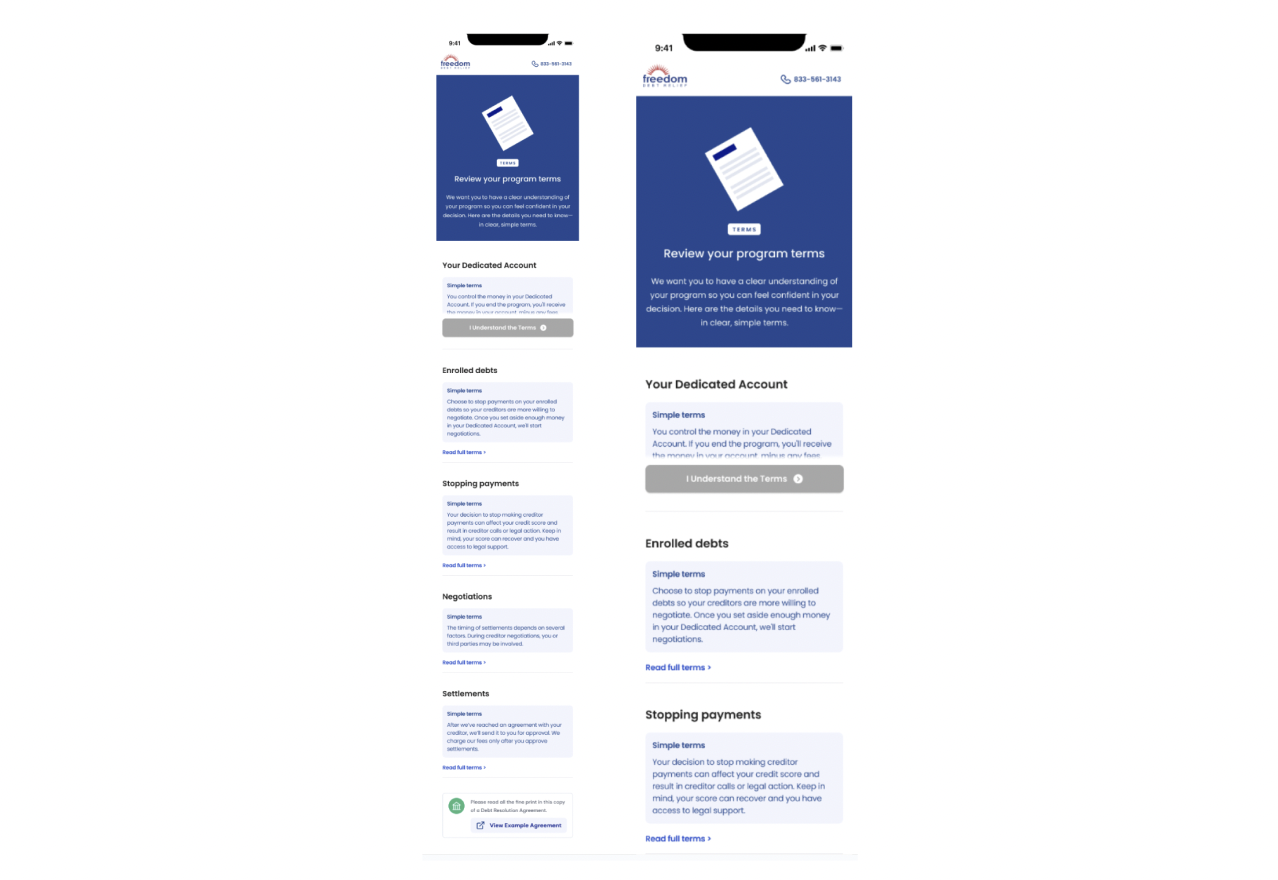
Terms page - live
✅ Simplified legal language so it’s easier to read, user-friendly, and minimizes jargon
✅ Included a “Simple terms” section to summarize the most important parts of each topic in a scannable way
✅ Dropped 6 reading levels to grade 7
✅ Consolidated the number of page sections from 12 to 6, condensed to about 1,300 words